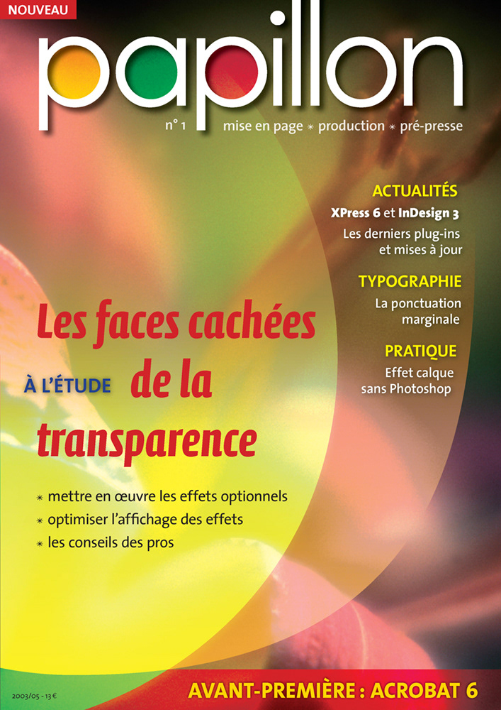
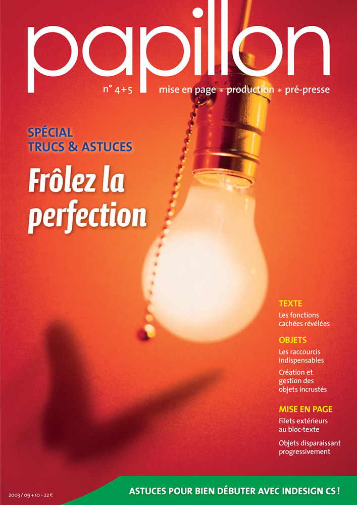
Years before InDesign Magazine and InDesignSecrets.com, ‛papillon’ (butterfly in French language) was the only printed magazine completed dedicated to Adobe InDesign. Its aim was to demonstrate the superiority of Adobe's page-layout application (starting from v2) over the legendary QuarkXPress.
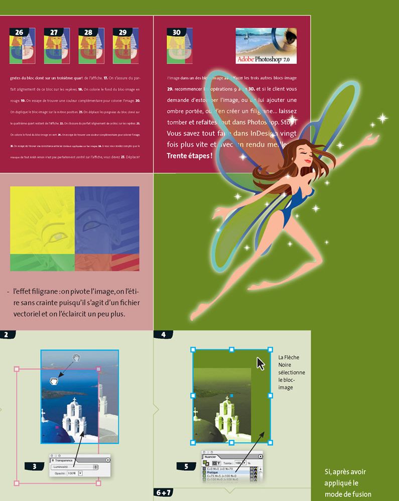
‛papillon’ contained tutorials of the most advanced InDesign features and was considered the most impressive technical publication on publishing at that time. For instance, every image composition was completely made in InDesign; Photoshop and Illustrator were almost never used.
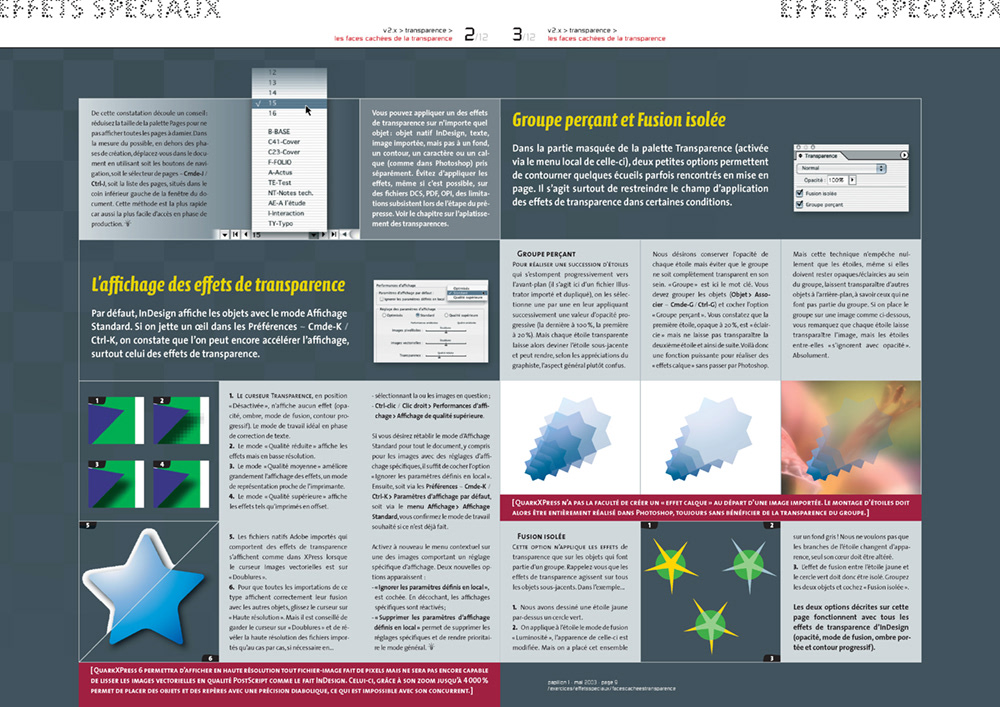
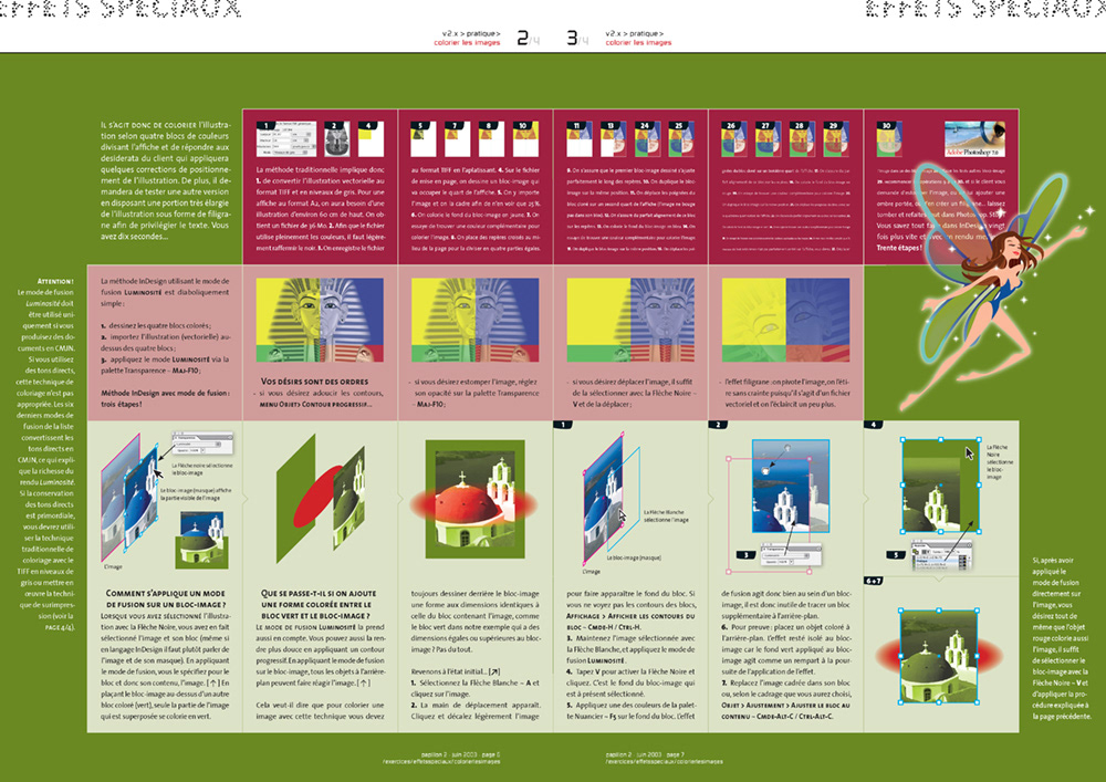
Every single option of InDesign's transparency features were thoroughly explained.
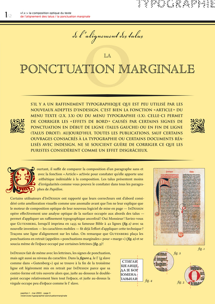
This page adopted the look and feel of very old publications to describe InDesign's hanging punctuation feature. I reminded the reader that Gutenberg also used this typographic technique in his legendary 42-line Bible.
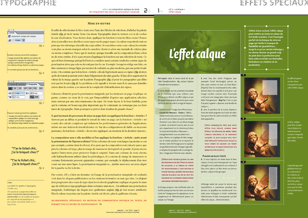

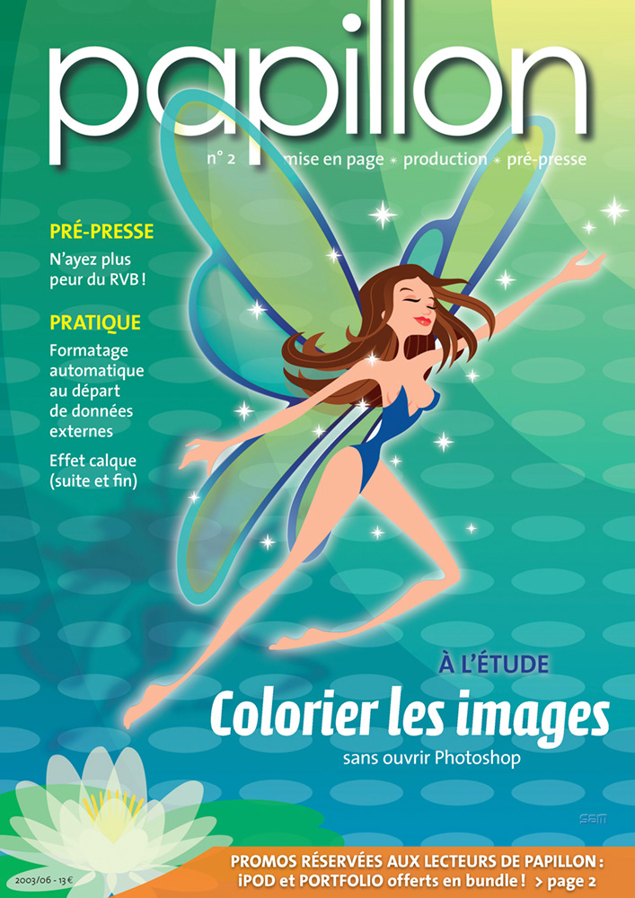
Illustration: Yann Samson (aka SAM)
The illustration of the nymph has transparent wings, and it covers part of the layout. Before InDesign 2.0, this technique was very difficult to achieve in QuarkXPress as the latter didn't support transparency. And you know what? It printed out smoothly with perfectly-flattened transparency.
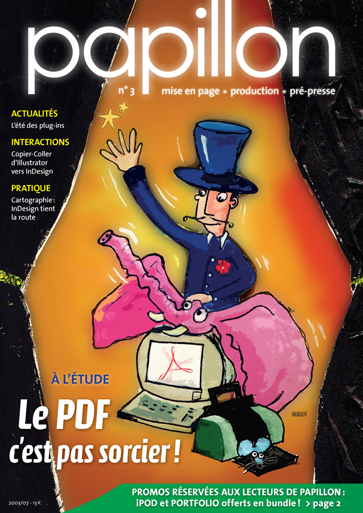
Illustration: Jonathan Van Iseghem

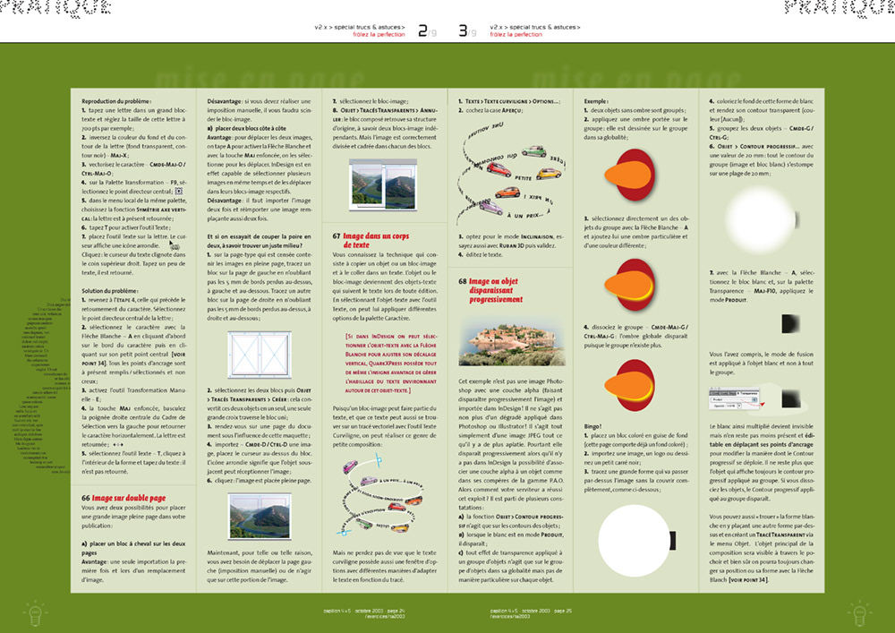
This issue contained hundreds expert-level tips and tricks that are still valid in today's versions of InDesign.
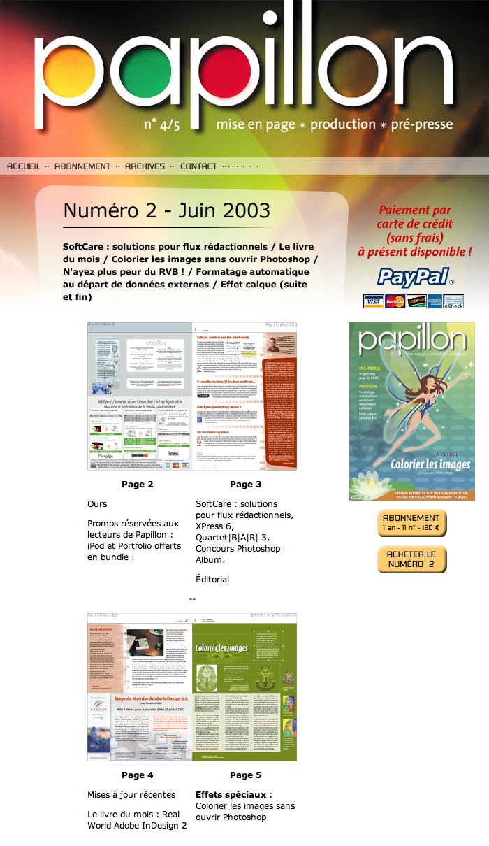
On ‛papillon’'s website, readers saw previews of upcoming issues, read the archives, bought issues,...